Michigan TS
CSS Anchor Positioning
Can you use it now?
Good evening. I’m here to answer the question- is CSS Anchor Positioning ready to use?
No.
And the answer is no. So let’s tweak the talk a bit.
Michigan TS
CSS Anchor Positioning
Why it’s awesome and how to determine when to use it
Instead, let’s talk about:
- what anchor positioning is,
- how it’s going to make dropdowns more performant and easier to implement.
- Let’s talk about how it
- simplifies existing patterns
- and how it makes new layouts and designs possible.
And then, once I get you all excited to use it, let’s see if it’s actually ready to be used, and more generally, look at how to determine whether a web platform feature like anchor positioning is ready to be used in your project.

What is Anchor Positioning?
- Positioning a floating element
- Relative to another element
Floating elements
Removed from the normal flow of the document
What is Anchor Positioning?
- Positioning a floating element
- Relative to another element
Relative to what?
What is my coordinate system?

We can’t just have it hovering there without context.
Positioning provides context for the user’s actions.
Especially for floating content, positioning provides context clues to the user. If they’re taking an action, what are they taking an action on? How did they get to this menu?
position: absolute
or
position: fixed
First, we need to make our element float.
- absolute positioned relative to its positioned ancestor
- fixed positioned relative to the viewport
So how do we provide the context for an element when we don’t want it relative to an ancestor or relative to the viewport? How do we do that without bolting together two elements that may need to move and flow separately, or need to be created or managed separately?
CSS anchor positioning adds a third option
I’ve blurred out the good bits so we don’t get ahead of ourselves here.
CSS anchor positioning lets you position an element relative to another element. With just a few CSS declarations that we’ll be learning today, the element escapes its containing block and becomes positioned relative to a different element.
Why it was hard in CSS
- DOM structure
- Overflowing content
So, let’s try it in JavaScript
popper.js
const button = document.querySelector('#button');
const tooltip = document.querySelector('#tooltip');
computePosition(button, tooltip, {
  placement: 'right'
}).then(({x, y}) => {
  Object.assign(tooltip.style, {
    left: `${x}px`,
    top: `${y}px`,
  });
});Why it was hard in JavaScript
- Unique IDs
- Imperative
- Performance
- Dependencies
- Package size
You need to tell the browser exactly what to do, not just what you want. (“I want a sandwich” vs “Get out the bread and peanut butter”)
The browser can do things with lower level code, which can make things much more performant.
If only there was a way to get the features of JavaScript with the performance and declarative syntax of CSS.
CSS anchor positioning
That’s where CSS anchor positioning comes in, so let’s see how it works.
We already know how to make things float, using absolute or fixed positioning.
Relative to what?
But what are we positioning things relative to?
.anchor { anchor-name: --my-anchor; }
.positioned { position-anchor: --my-anchor; }First we need to make our anchor a valid anchor
by giving it a name.
The -- tells us this is a custom, author-provided name.
This is the same as using CSS variables.
CSS will never add a keyword that starts with 2 dashes.
Then, we tell our positioned element to use that as our anchor
using the position-anchor property.
We are anchored!
We set the anchor-name, position-anchor. More on position-area later. Note that there is no connection in the HTML, in the content layer. All the connection exists in the presentation layer, in the CSS.

Explicit Implicit anchors
Go anchor yourself, San Diego.
But we don’t always have to explicitly declare a relationship.
popover
Browser support forpopover
The Popover API is great match for anchor positioning.
popover creates an implicit anchor on the popover trigger
[popover]{
  margin: initial;
  padding: 0;
  border: 0;
}A popover is centered by default, you will likely want to override the popover’s margin.
position-area
So how do we place this item?
The spec creators realized that you almost always want to place
the positioned item right next to the anchor,
in some portion of the surrounding area.
position-area essentially creates a 3x3 grid around the anchor,
and then provides a way to easily place your element relative to that grid.
.positioned {
  position-area: end;
}<position-area> = [ [ left | center | right | span-left | span-right | x-start | x-end | span-x-start | span-x-end | x-self-start | x-self-end | span-x-self-start | span-x-self-end | span-all ] || [ top | center | bottom | span-top | span-bottom | y-start | y-end | span-y-start | span-y-end | y-self-start | y-self-end | span-y-self-start | span-y-self-end | span-all ] | [ block-start | center | block-end | span-block-start | span-block-end | span-all ] || [ inline-start | center | inline-end | span-inline-start | span-inline-end | span-all ] | [ self-block-start | center | self-block-end | span-self-block-start | span-self-block-end | span-all ] || [ self-inline-start | center | self-inline-end | span-self-inline-start | span-self-inline-end | span-all ] | [ start | center | end | span-start | span-end | span-all ]{1,2} | [ self-start | center | self-end | span-self-start | span-self-end | span-all ]{1,2} ]
position-area keywords
- physical or logical
- span-[area] = 2 columns
- span-all = 3 columns
- self = element’s own writing mode
Change the position-area value
anchor()
position-area works in most cases, but what if it doesn’t?
.positioned {
  position-anchor: --my-anchor;
  top: anchor(bottom);
}.positioned {
top: anchor(--my-anchor bottom);
}.positioned {
position-anchor: --my-anchor;
top: anchor(bottom);
left: anchor(--other-anchor left);
}Only valid on inset properties
You can even anchor every side on a different anchor.
Cool, but I was promised new possibilities
anchor() is a length
top: 1px;
left: 1rcap;
right: 50cqi;
bottom: 50dvh;top: anchor(bottom); /* 131.1px */top: calc(anchor(bottom) + 1rem);anchor() is a length
But can only be used on insets
Let’s talk about the design constraints of this type of layout.
- The names are on the right of the photos, but with a bit of space.
- The names are in the same row as their image.
- The name is either at the top of the row, or just below the name above them.
And we have a few web-specific constraints:
- There are 4 images in a row, but since screens are different sizes, maybe that should be dynamic?
- The image and name should be connected for things like screen readers and interactions.
Handling overflow
position-try-fallbacks
Values
position-areavaluesflip-block,flip-inline,flip-start- custom
@position-tryrule
To recap, we placed the names where we wanted them. Then, we placed the cards relative to the names based on their writing direction. Then we used position-try-fallbacks to handle the cases where the positions overflowed. I’m not sure this is actually how I’d actually do this layout, but I wanted to incorporate Euchre.
anchor-size()
So far, we’ve been concerned with positioning, with placing an element, with setting its coordinate offset. But we can also use the size of our anchor.
width: anchor-size(--anchor width)width: anchor-size(--anchor height)You can refer to the opposite dimension.
position-anchor: --anchor;
width: anchor-size();anchor-size() is valid for
- sizing properties
- insets (top, left, etc)
- margin
Set the inline-size to anchor-size() and the min-inline-size to max-content
Should you use anchor positioning?
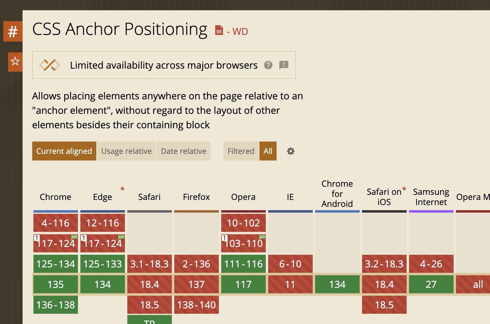
anchor-positioning
Browser support foranchor-positioning
How do you decide?
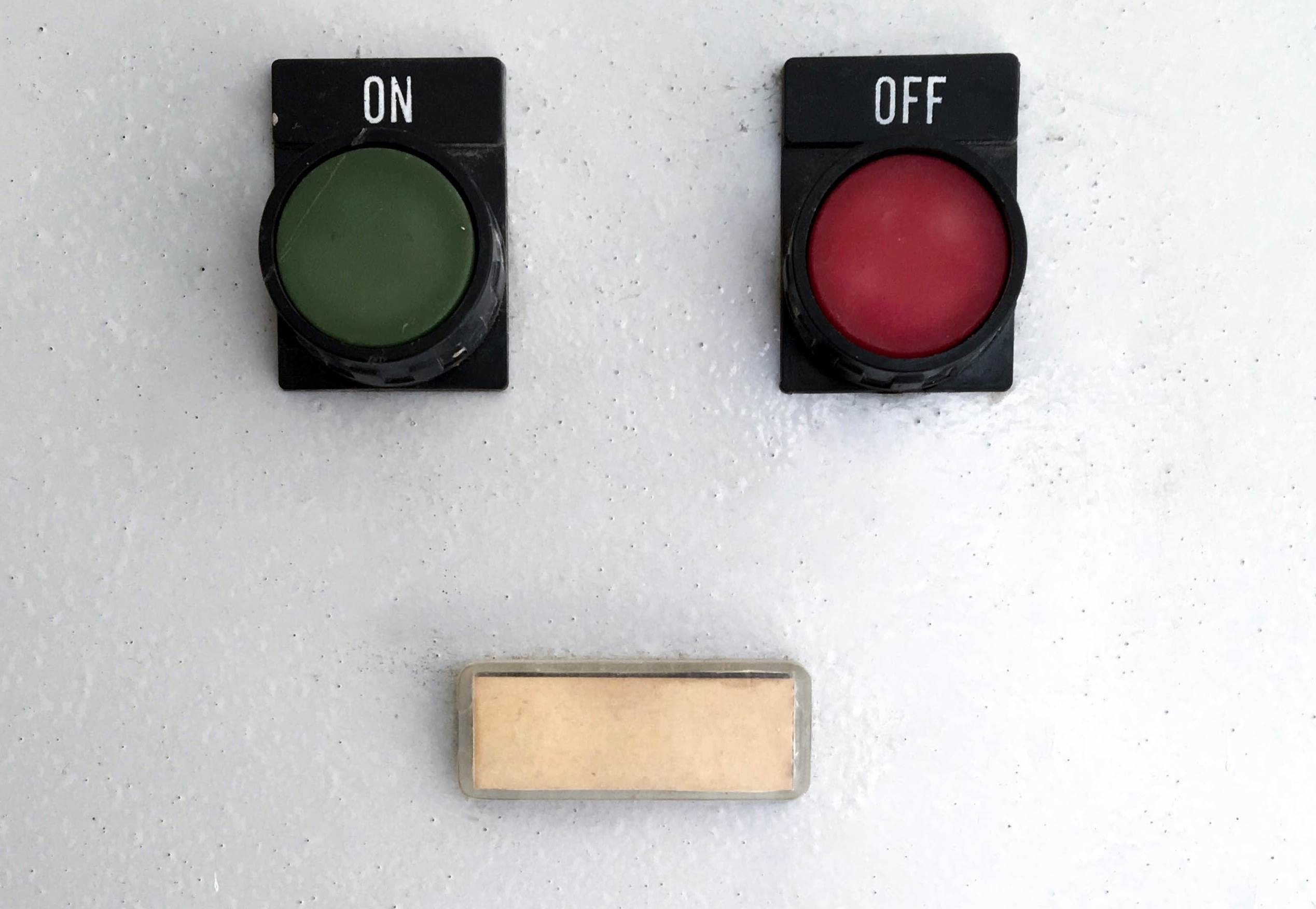
The web platform is constantly evolving, how do you keep up? How do you make the decision a feature is safe to use?
It works on my machine
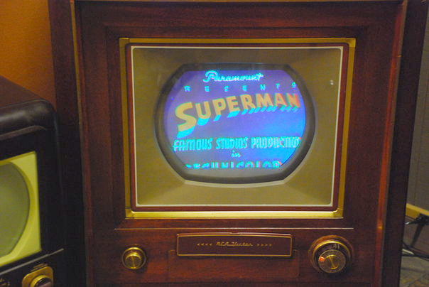
It’s like the adoption of Color TV. Broadcasters didn’t want to start broadcasting in color until viewers had color TVs. Viewers didn’t want to buy color TVs until there was color programming. But viewers had control over their own machines.
Your code is running on an unknowable machine.

Graphic design of unknown content with unknown collaborators, on an infinite and unknowable canvas, across operating systems, interfaces, languages, and writing modes…
To quote my fellow OddBird, web development is essentially…
It works on my machine
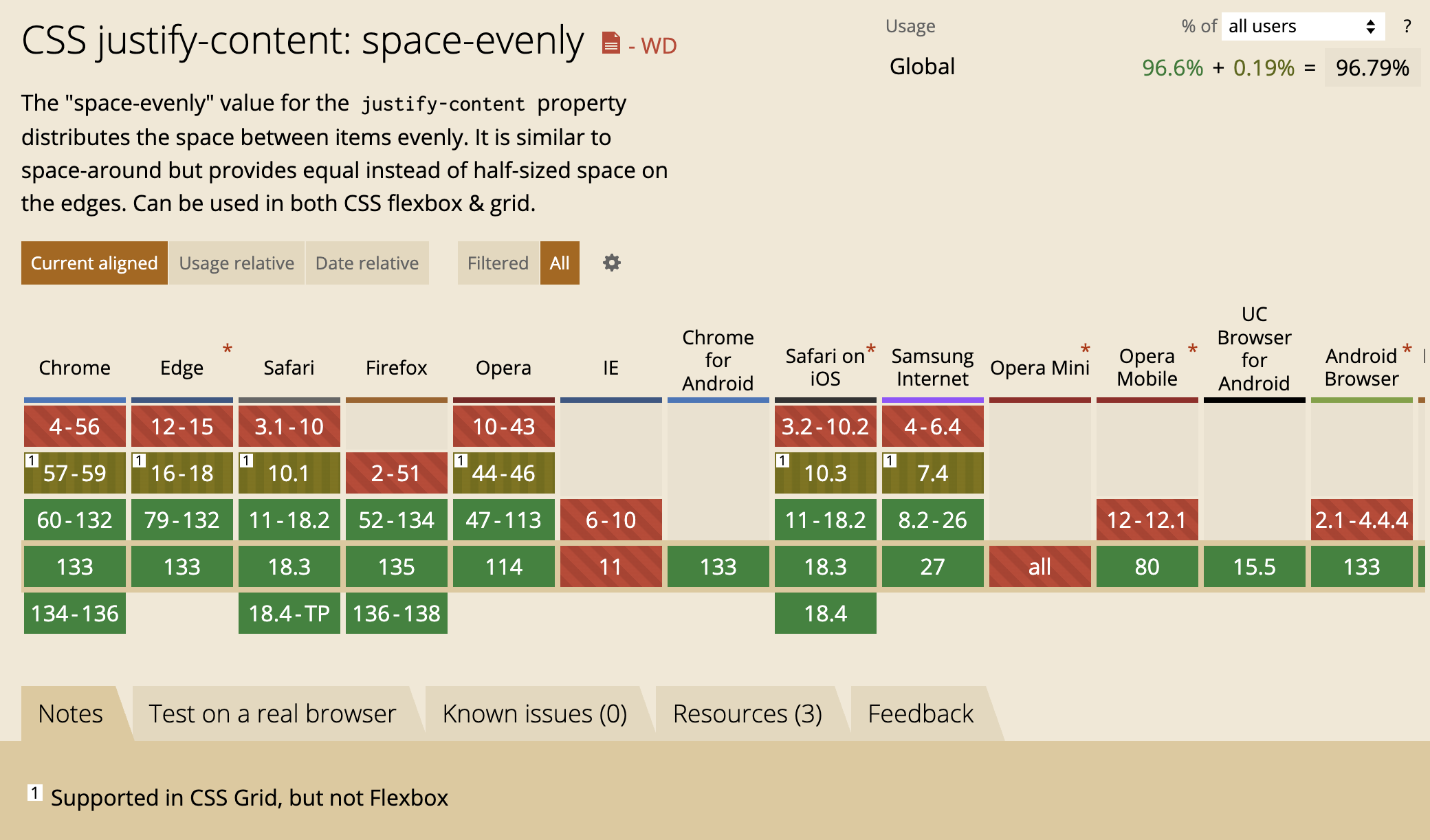
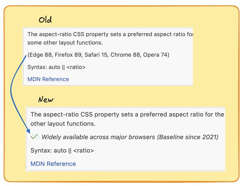
Maybe you check out Caniuse, but what is this telling you?

Clearly, not available in all browsers yet so unless you’re in a Chrome-only environment, it isn’t quite ready
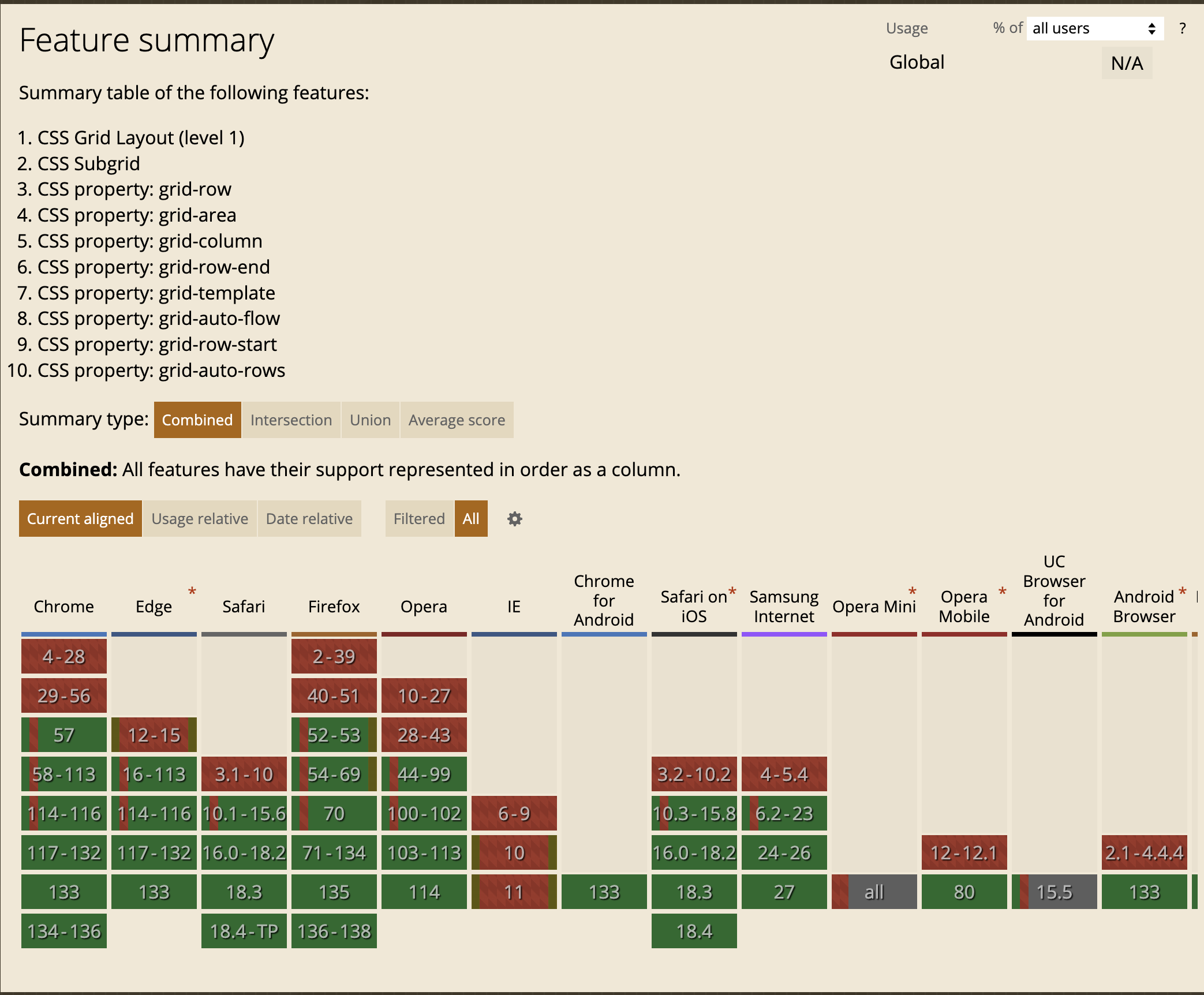
But tools on the web are rarely simple and straightforward. Sub grid came later. Maybe also grid-auto-rows
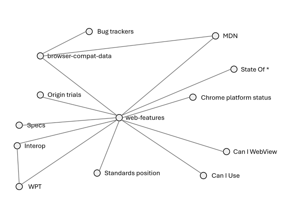
browser-compat-data tracks individual parts of the web platform
Browser support for 15,222 web api parts
BCD tracks browser support for 15k different items
When did Firefox support the hover selector for non <a> elements?
Does Safari on iPad support the ew-resize cursor if you have a connected mouse?
When did Opera add the direction attribute for the marquee element?
That’s not how developers talk about things.
Developers talk more generally. Not about a certain attribute or property or keyword but rather about features.
Bird.
For many, knowing you saw a bird is enough.
Woodpecker.
Some may be interested you saw a woodpecker.
Pileated Woodpecker.
Birders will want to know what kind of woodpecker.
Jerome.
Usually no one cares exactly which pileated woodpecker you saw.
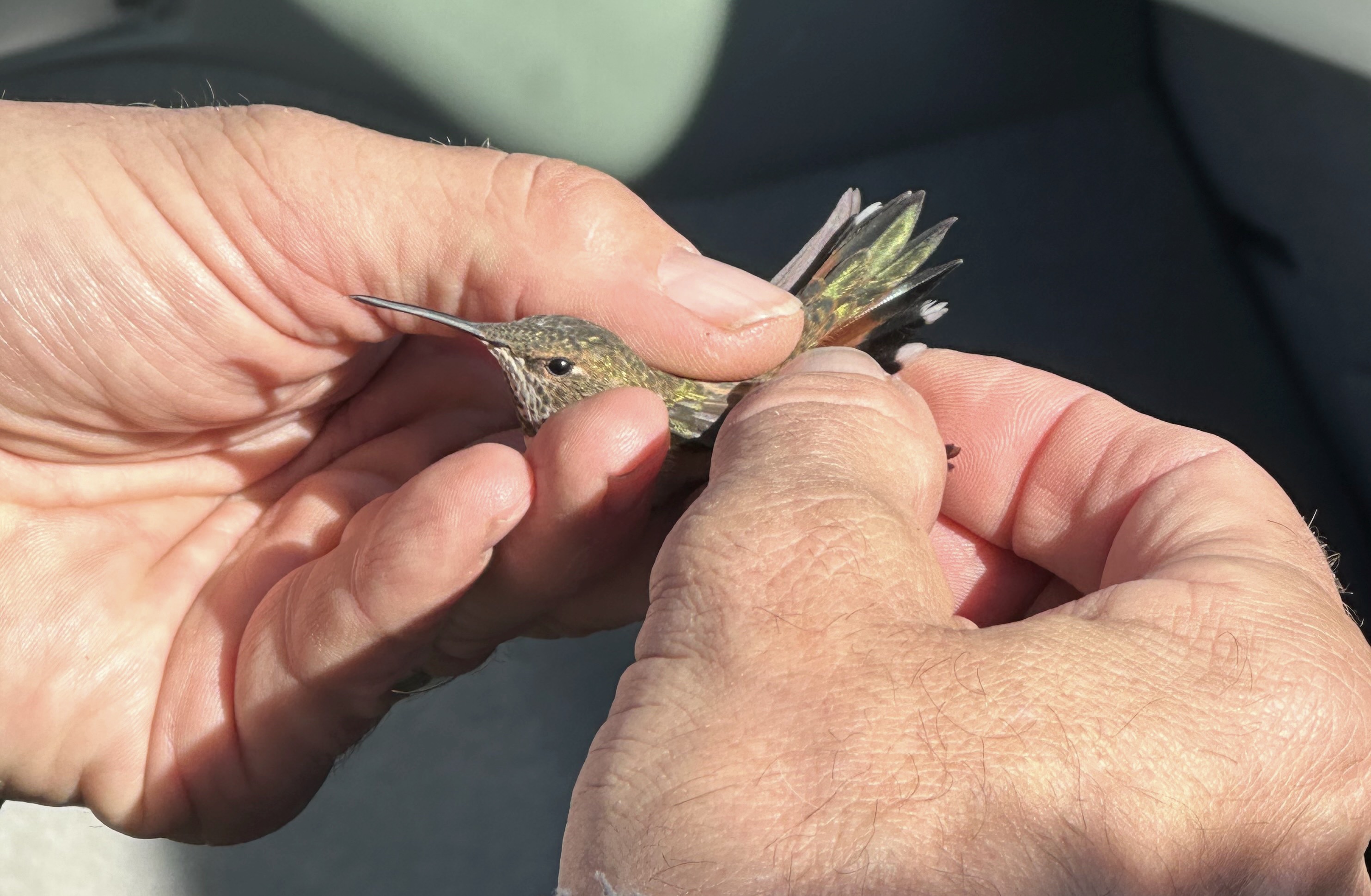
Sometimes you do need to know a specific bird. This is a Rufous Hummingbird I watched get banded. It was a ridiculously small band. Banding and tracking individual birds is similar to BCD data. It’s useful when you need it, but most of the time you can be more general.
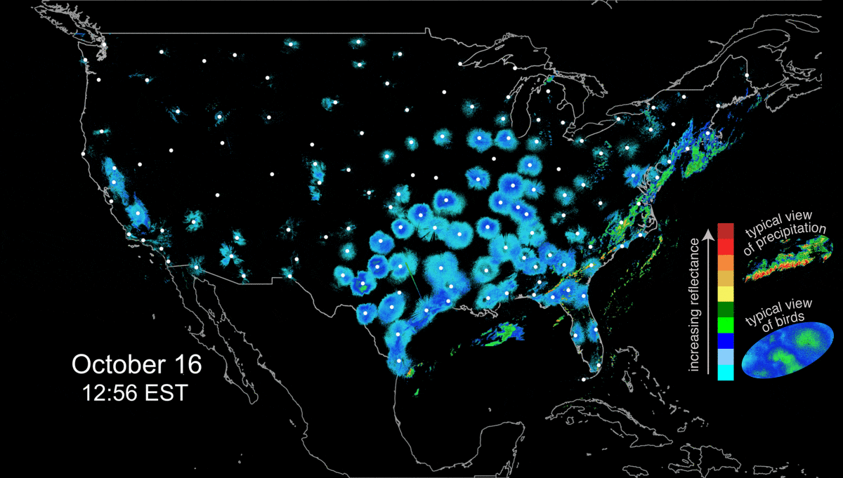
You can also zoom too far out, to the point where you are only seeing things at a macro level. During migration, flocks of birds show up on radar, and scientists use that data to track patterns and let birders like me know when to take the morning off to see what birds are around. It is useful to track both large scale migration and individual birds, but neither is what you want when you are trying to identify a bird. In the same way, what’s the right granularity for knowing when you can use a web feature?
There’s a need for a more general way of talking about features.
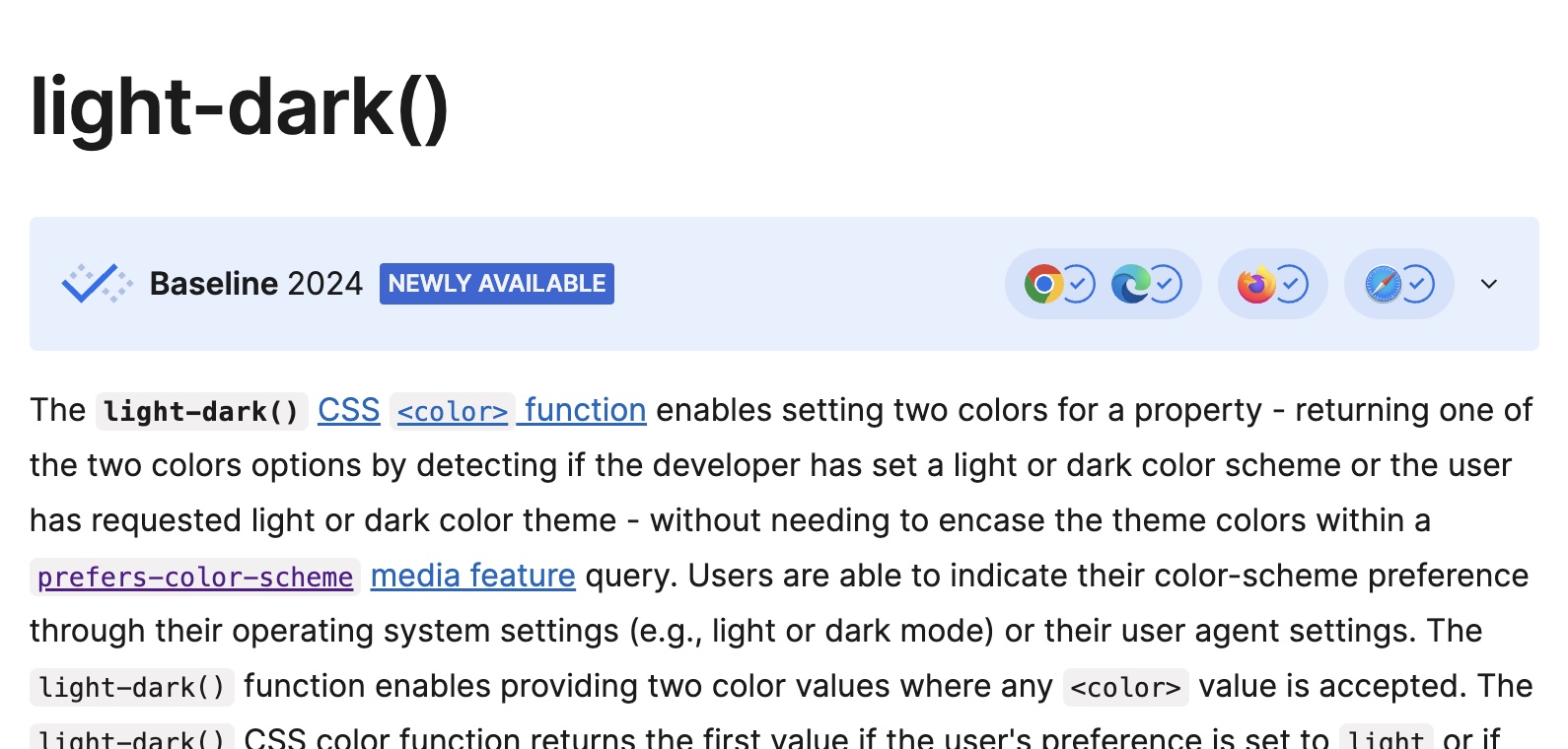
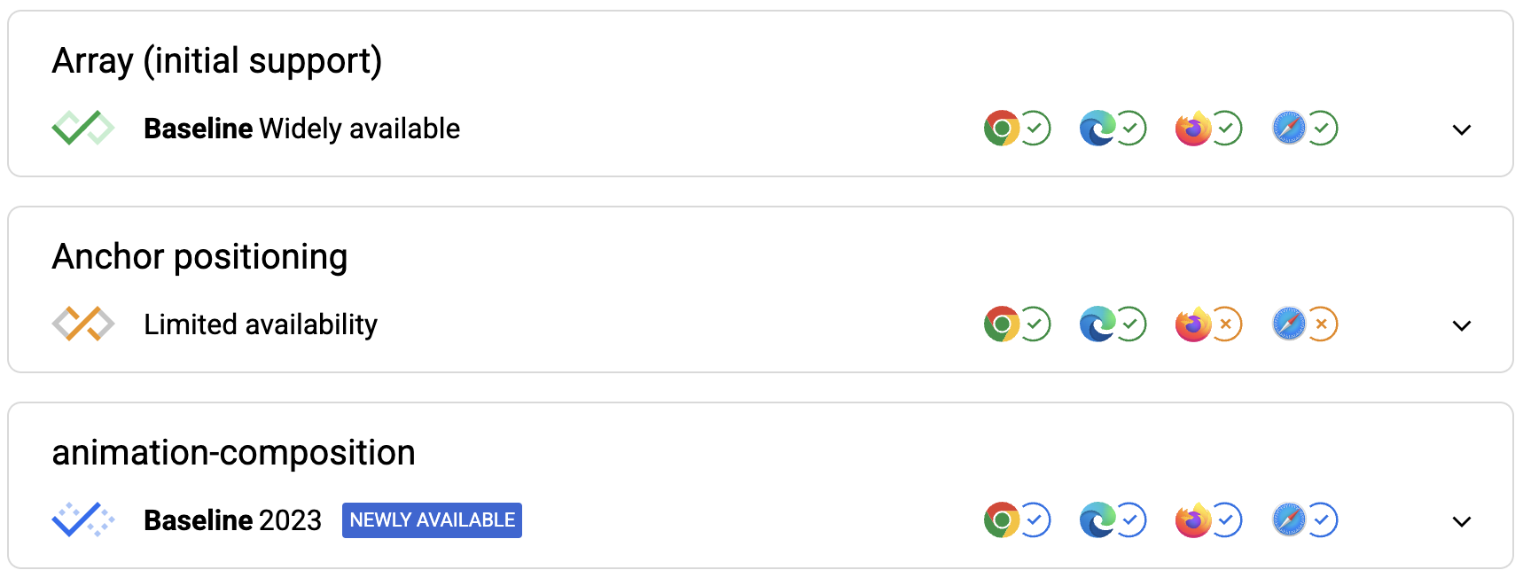
Browser support for 1062 features
I was part of an effort to distill those 15000 web api parts into something closer to how developers think. It’s currently at 1062 different features.
Those features, along with the Browser Compat Data, power Baseline.
Feature support in
- Chromium (Chrome/Edge)
- Safari
- Firefox
This does not include Node, Deno, Bun. That’s a different problem space. You control the runtime. On the web, you don’t have that control.
Available for 30 months
30 months seems to be enough time to get most people updated. It isn’t 100%, but it’s (probably) close enough. Different browsers release at different cadences, so time was more consistent than versions.

If it fully meets these criteria, it is considered Baseline Widely Available.


Web features and baseline boil things down to essentially a ues or no.

But that doesn’t reflect the complexity or full suite of options available.
The squishy parts
- Can it be progressively enhanced?
- Is the site usable without it?
- Are there polyfills available?
- Are some parts of the feature older?
Where can I use it?
The data is open, so we have our own web component, using it for this.
You can explore the features, and also see a sort of release notes for the web, that show what is newly available and widely available for use.
Does Baseline work for you?
Baseline is for a simple decision that will work in most use cases. If the 30 month works for you and for the target demographics of your product, you can take the baseline as what a group of experts recommend. Baseline Widely Available is perhaps overly cautious. If there’s a feature you want to use, and it’s “Newly Available” or “Limited Availability”, look at ways to use it without excluding users with older browsers.
So can you use anchor positioning?
anchor-positioning
Browser support foranchor-positioning
No, but…
if (!("anchorName" in document.documentElement.style)) {
  import("https://unpkg.com/@oddbird/css-anchor-positioning");
}- Any browser
- Support back to 2017
- CSS Anchor Positioning API
- JavaScript/Floating UI under the hood
It’s what you’d end up using under the hood, but with the modern API, and it won’t impact users on newer browsers.
Polyfill limitations
- No support for dynamic elements (yet)
- Not feature complete (yet)
- No partial support, so some gaps in Chrome
(Fund us)
So… can you use anchor positioning?
Probably?
Definitely can play around with it, and learn it. Depending on your use case, you can use the polyfill to get this for your users now.
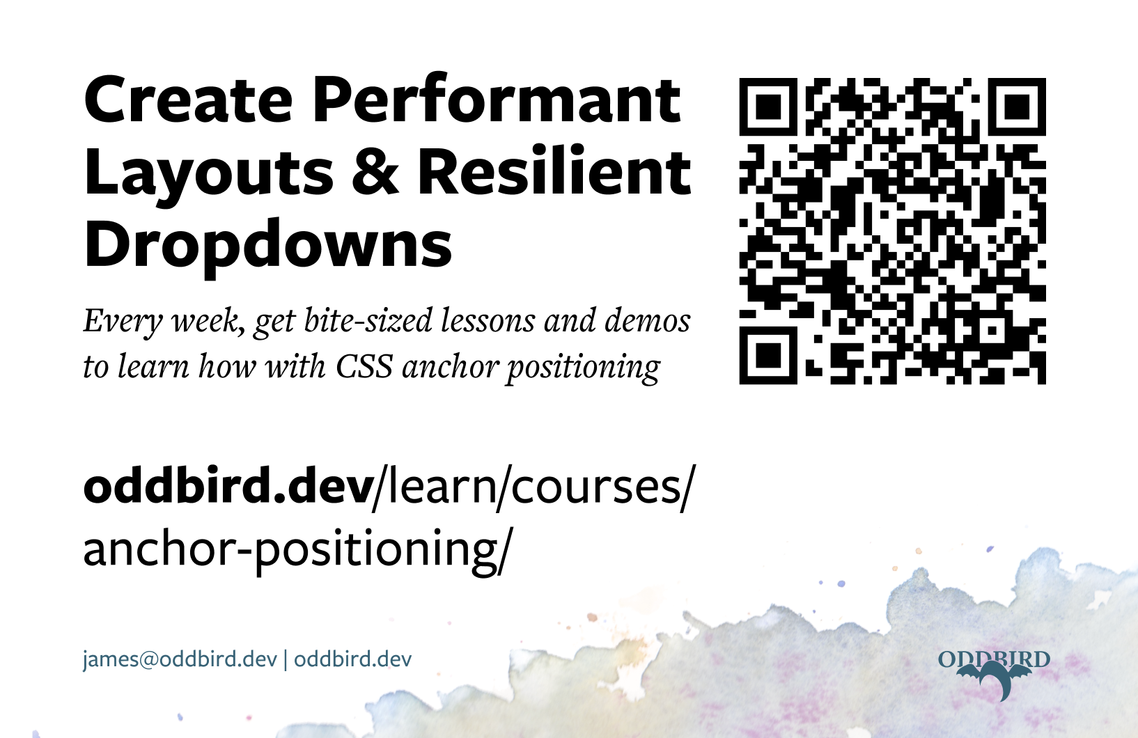
More from OddBird
- We’ll build your Web Apps
- Office Hours and Coaching
- Resources for Learning